Overview
The Problem
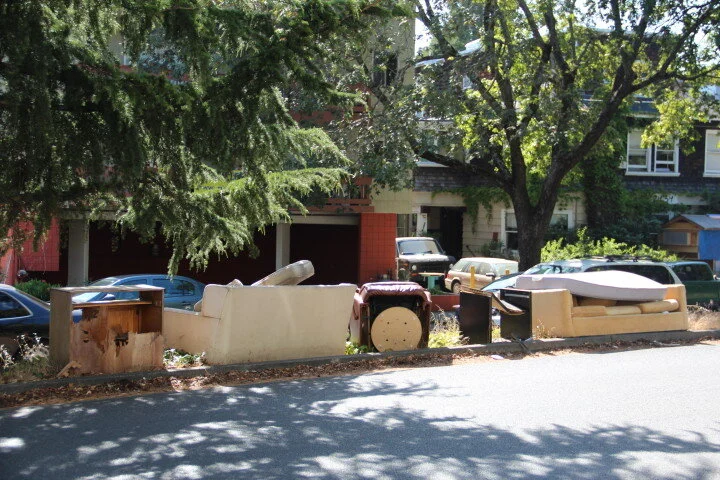
There is a lot of secondhand furniture on the street in the neighborhoods around the UC Berkeley campus, especially during graduation seasons. The discarded furniture not only creates waste, but is also an eyesore for the community.
My Solution
Bears’ Furniture is an app that provides unique services that match users’ needs during the process of trading, dropping off, picking up, and reporting the location of secondhand furniture, benefiting not only students, but also Berkeley residents, who can enjoy cleaner, tidier neighborhoods.
Research
Moving is among the most cumbersome life events because it involves buying new furniture, selling old furniture, and physically transporting it, along with other challenges. Many students choose to leave their old furniture on the sidewalk, especially during graduation season, hoping that someone will bring it home. But the truth is, old furniture often sits on the street for about a week, then gets picked up by the city of Berkeley’s recycling service, unless people pick it up beforehand. All of this results in a pretty messy neighborhood.
I began the project by looking up some housing facts about UC Berkeley.
There are about 42,000 students each year: 37% of them live on campus, and 63% live off campus. Only the campus residence halls are fully furnished. The rest of the housing options require students to bring in additional furniture as needed, which means more than 70% of students need to get their own furniture. Among that subset of students, at least 50% of them change apartments during their years of study, meaning that they will need to deal with buying and selling new or used furniture.
User Journey Map
With my research findings, I created a simple persona that embodied the archetypes of our user group. Then I mapped out the user journey of the persona Joanna, including her thoughts and feelings during her furniture shopping experience. From this, I was able to temporally visualize Joanna’s areas of frustration and create a focal point on the problem.
Pain Points
Students find it hard to buy secondhand furniture online, but they also don’t know where to look for furniture on the street if they want to pick it up for free.
The furniture is often too heavy for students to carry home on their own, and some students feel embarrassed to do so.
Students may have worries about whether the secondhand furniture is safe and clean.
Competitor Analysis
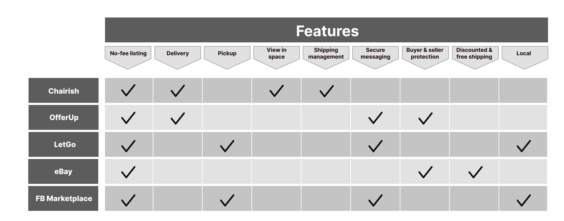
I then conducted semi-structured interviews with my old college friends and current UC Berkeley students. I also did a competitor analysis with some local secondhand furniture buying and selling apps to understand the existing strategies for buying/selling secondhand furniture.
Key Takeaway
There are some great secondhand furniture trading apps that provide fast and safe secondhand furniture trading services. However, the local culture in the neighborhoods around the UC Berkeley campus requires more specific services, which include helping people pick up furniture on the street, as well as repair and cleaning options.
Design Goals
Using the research and user journey map as a guideline, I summarized my findings with some design goals for our user group:
Help students find the location of furniture so they can pick it up.
Provide quick and responsive pickup and delivery.
Help students best market the secondhand furniture so they are less likely to throw the furniture away on the sidewalk.
Provide furniture repair and cleaning service so students feel sanitarily safe about picking up the furniture.
Ideation
User Flow
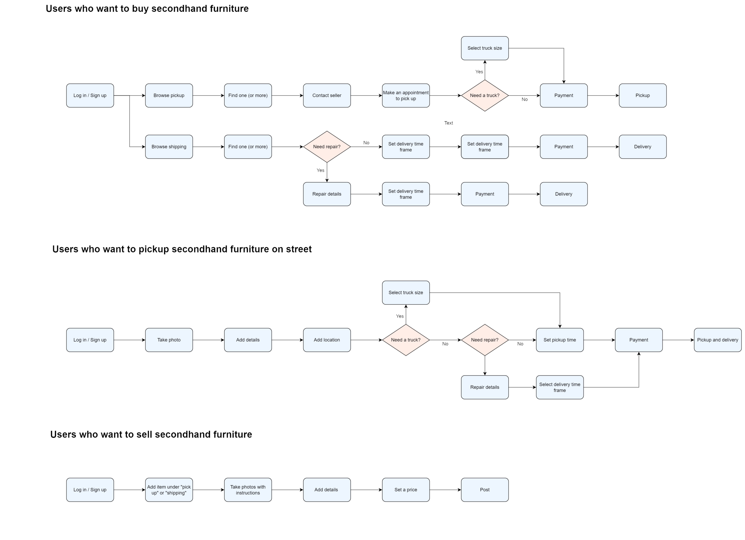
With the design goals in mind, I began to ideate potential solutions through a simple user flow diagram.
Lo-Fi Wireframe
I went through various scenarios during the process of buying and selling secondhand furniture, then I decided to pay a little more attention to helping secondhand furniture on the street be seen and picked up by others. I congregated two main functions into the app, which are:
Purchasing and selling secondhand furniture.
Reporting the location of the secondhand furniture with an option to pick it up.
I began by sketching out the low fidelity wireframe, which helped me set up the basic design structure.
Mid-Fi Wireframe
Then, I outlined the wireframes of the entire app and created several key path scenarios to further analyze the flow of interaction in the app.
Purchase
Based on my research and the interviews, the most straightforward way to lead users through the shopping process is to create “pickup” and “shipping” categories on the main screen. This instantly gives users the idea of which item fits into their preferred method of delivery. Users can decide if they need to rent a truck or ask for repair and cleaning services after seeing the photos and reading the detailed information about the furniture.
Report or pick up
Providing the same-day pickup option for users to get secondhand furniture on the street delivered to their homes is the direct solution to making the city of Berkeley cleaner and tidier. Users can order furniture pickup spontaneously. All users need to do is locate the furniture, provide detailed information about the furniture, and then order the pickup service.
Additional feature to help user marketing their furniture
Marketing secondhand furniture better is the indirect way to reduce the chance of having messy neighborhoods. Sellers upload photos of the furniture following a guide, which gives viewers a better understanding of the basic dimensions and conditions so they can decide whether they need to rent a truck of a certain size or order repair services. Sellers can also learn to take photos of furniture more strategically by clicking on “tips for photos.”
User Testing
After straightening out the overall user flow and different scenarios, I did a quick test to find out the pros and cons of the current design. The feedback was positive in general, but there were a few suggestions for improvement:
The item thumbnail images are too small on the browsing page for some users.
It is not very easy for users to decide if they need a truck or a repair service.
The app is not appealing enough in terms of encouraging people to use it or encouraging users to sell, buy, pick up, or report secondhand furniture.
A display switch button was added to the main page so people can change their preferred display layout.
Users may find it hard to decide if they need to rent a truck or order repair services because they cannot reliably or accurately get the details of the secondhand furniture. Making the furniture’s condition and dimensions required fields can guarantee users the basic information to help with their decision-making.
To make Bears’ Furniture more appealing, I introduced a reward system. Users logged in with their CalNet IDs who report furniture that gets picked up successfully will get a $2 coupon at any Cal cafe or store on campus. If users sell their secondhand furniture successfully, they will get a $1 coupon instead. Or, they can get $5 off the next time they use Bears’ Furniture. Those who use the service without CalNet IDs will get only $5 off their next Bears’ Furniture purchase or order.
Design
After several rounds of revisions on the wireframes, I then moved on to the final design of the app. The motivation of the visual design was to create a bold, fresh look that entices people to use the app. Gold and Berkeley Blue were chosen as the main colors to associate the app with the UC Berkeley theme.


